COMPANY: POSSIBLE New York
ROLE: Creative Direction (partnered with Lead Copywriter)
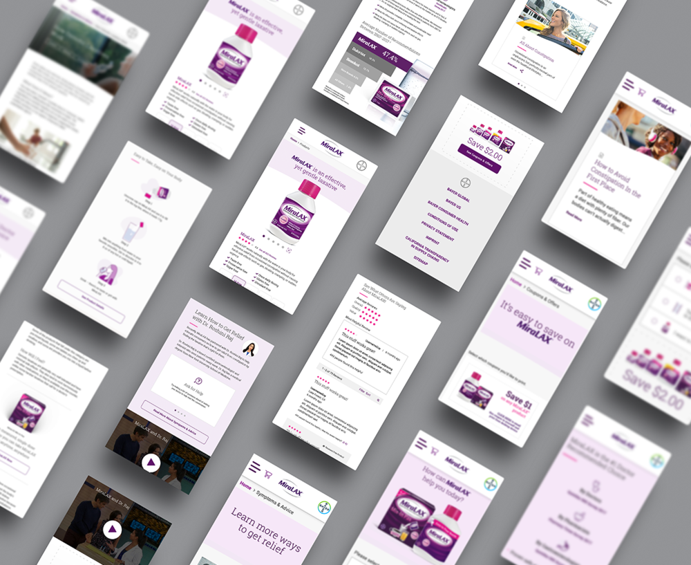
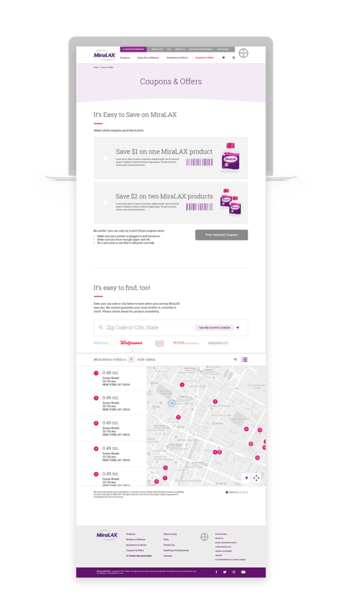
CHALLENGE: Our challenge was to redesign miralax.com in a way that would make people visit the MiraLAX website for more than just the downloadable coupon.
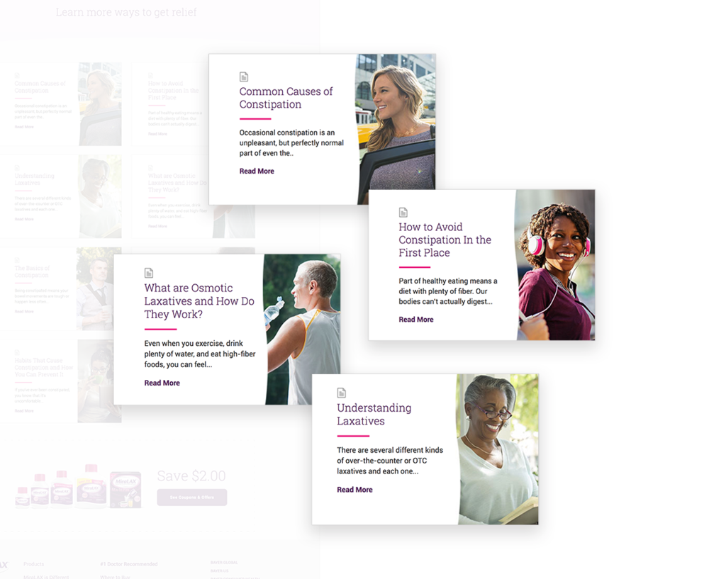
INSIGHT: Beyond the purchase, we win by delivering content that connects emotionally—because we know that constipation is a highly emotional issue.
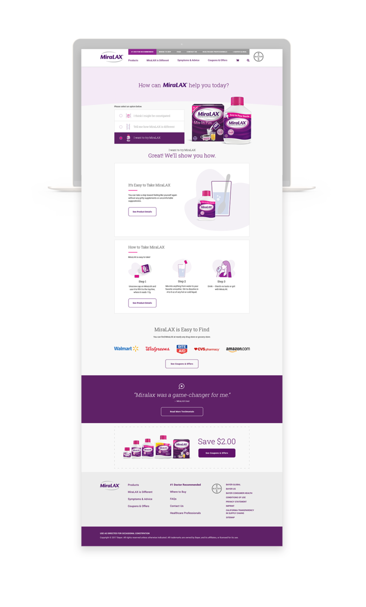
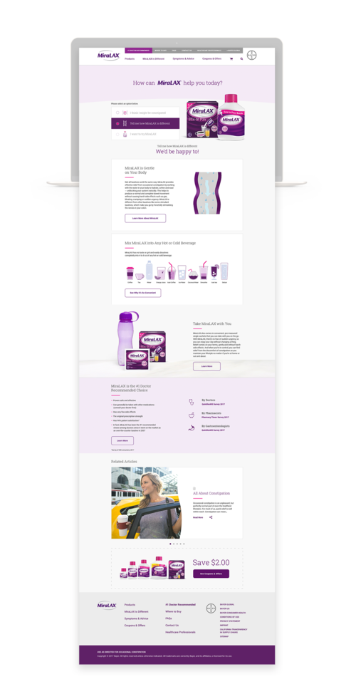
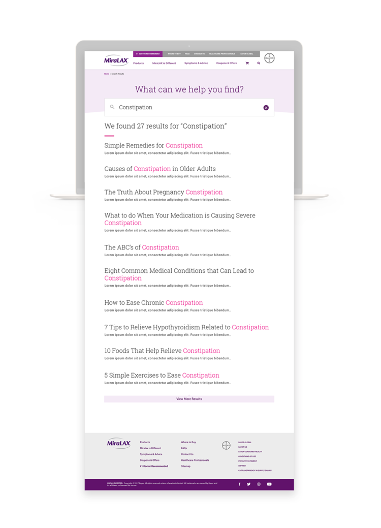
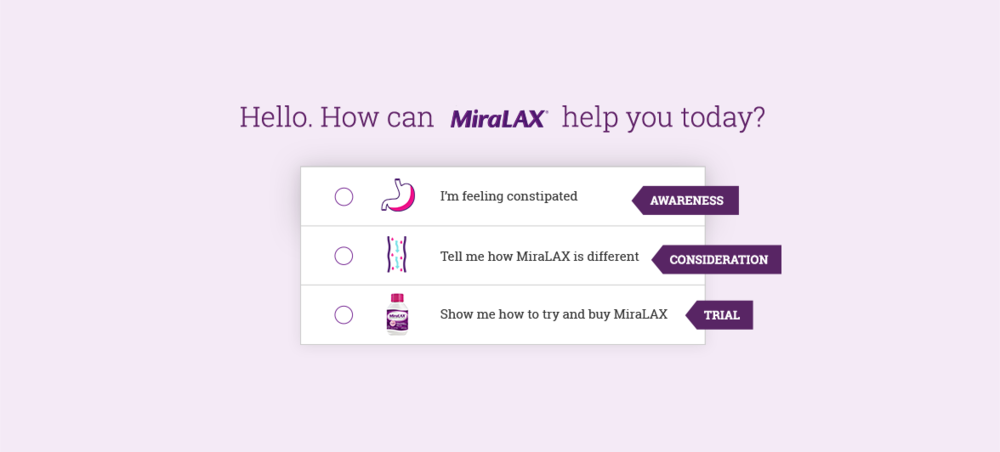
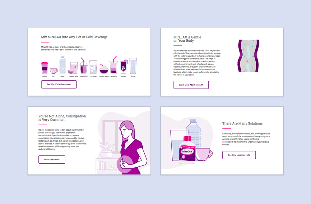
SOLUTION/CONCEPT: "Take Back Control": Consumers who arrive on the site seek specific answers to their constipation. Let’s ask them what they’re looking for and lead them to answers that will help them live a better life through MiraLAX. We will be the candid friend who empowers you to speak freely and take control. We will achieve this through light touch personalization. I worked very closely with both the strategy and the UX teams on a daily basis while managing a team of six to seven creatives. The existing site wasn't successful as people weren't interacting with the brand. Visitors would arrive on miralax.com, stay only long enough to download a coupon, and never visit again. We realized the entire site needed an update: updated visuals, structure, tone, and function.

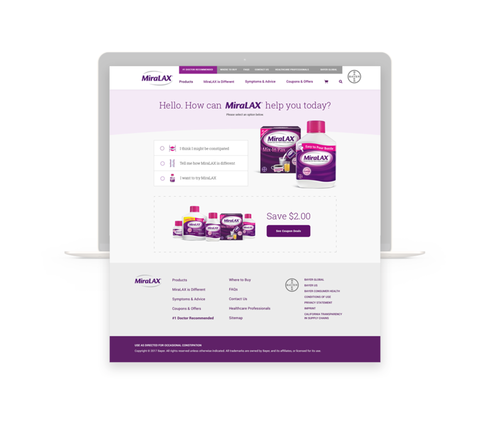

PHASE 1: SITE DISCOVERY
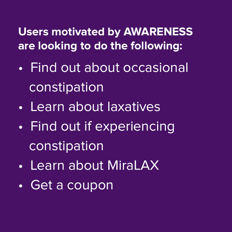
We determined the site's purpose, how to differentiate/relevant the brand digitally, identified user goals when visiting the site (Awareness, Trial, Consideration), and optimized and connected to the eCommerce experience on Amazon.com. Content consumption can drive commerce intent as much as commerce intent can drive content consumption.
PHASE 2: CREATIVE REFINEMENT
Shared how the proposed design was more closely aligned with the user's goals


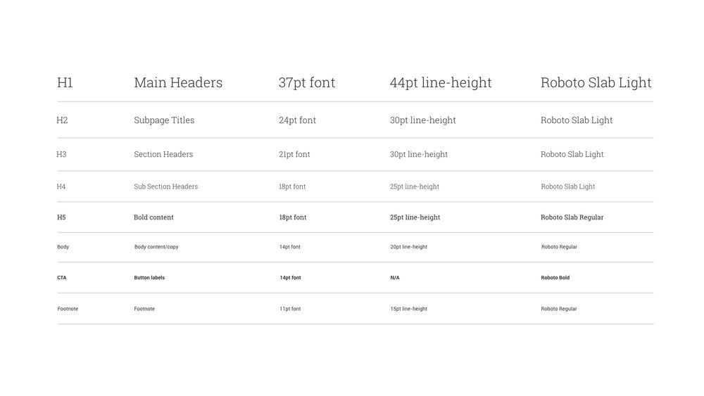
Click here to view the style guide.


