COMPANY: Possible New York / Role: Creative Direction (partnered with Lead Copywriter)
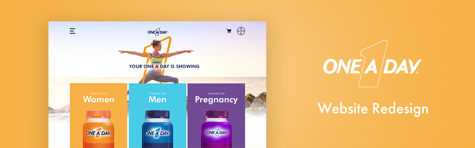
CHALLENGE: The One A Day brand has provided nutritional support for decades. But in a time when the competitive environment was more crowded than ever, One A Day was at risk of being left behind. Without a way for consumers to purchase online, Oneaday.com was in desperate need of a refresh, aesthetically and functionally.
INSIGHT: People want to be healthier but are lazy. People also want a product that speaks to their individual lifestyles. In the digital age, people feel more comfortable doing their own research and taking their health into their own hands. Still, the multivitamin category is crowded, and the products are all very similar.
SOLUTION/CONCEPT: ONE SIZE DOESN’T FIT ALL: By understanding the consumer, OAD can bring out what’s unique in them. "OAD understands you and will help you find a product that fits your lifestyle — no matter where you are in life.”
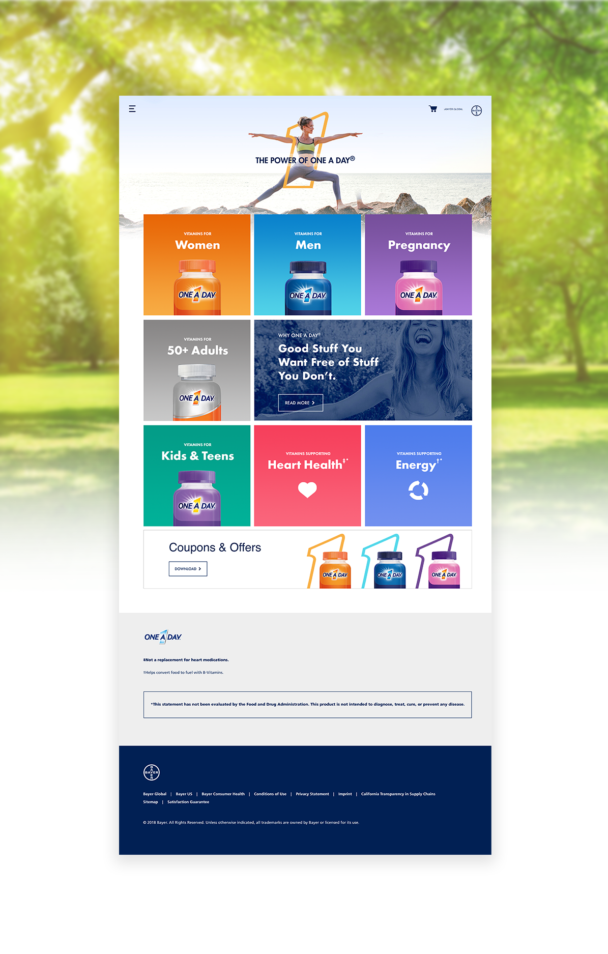
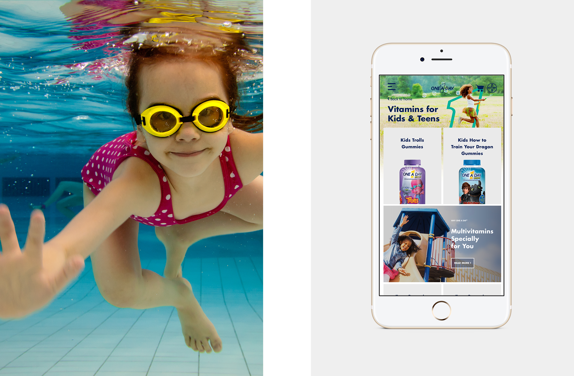
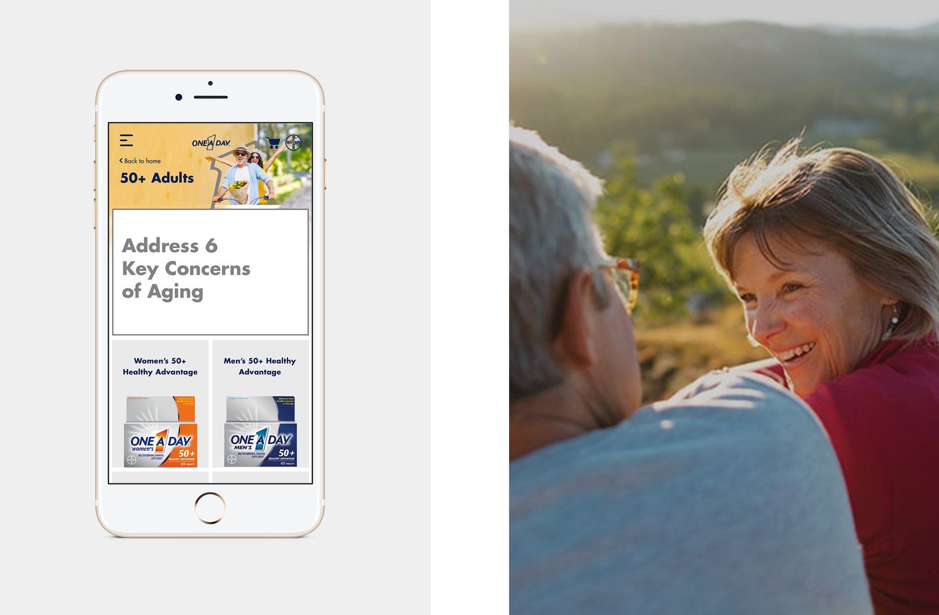
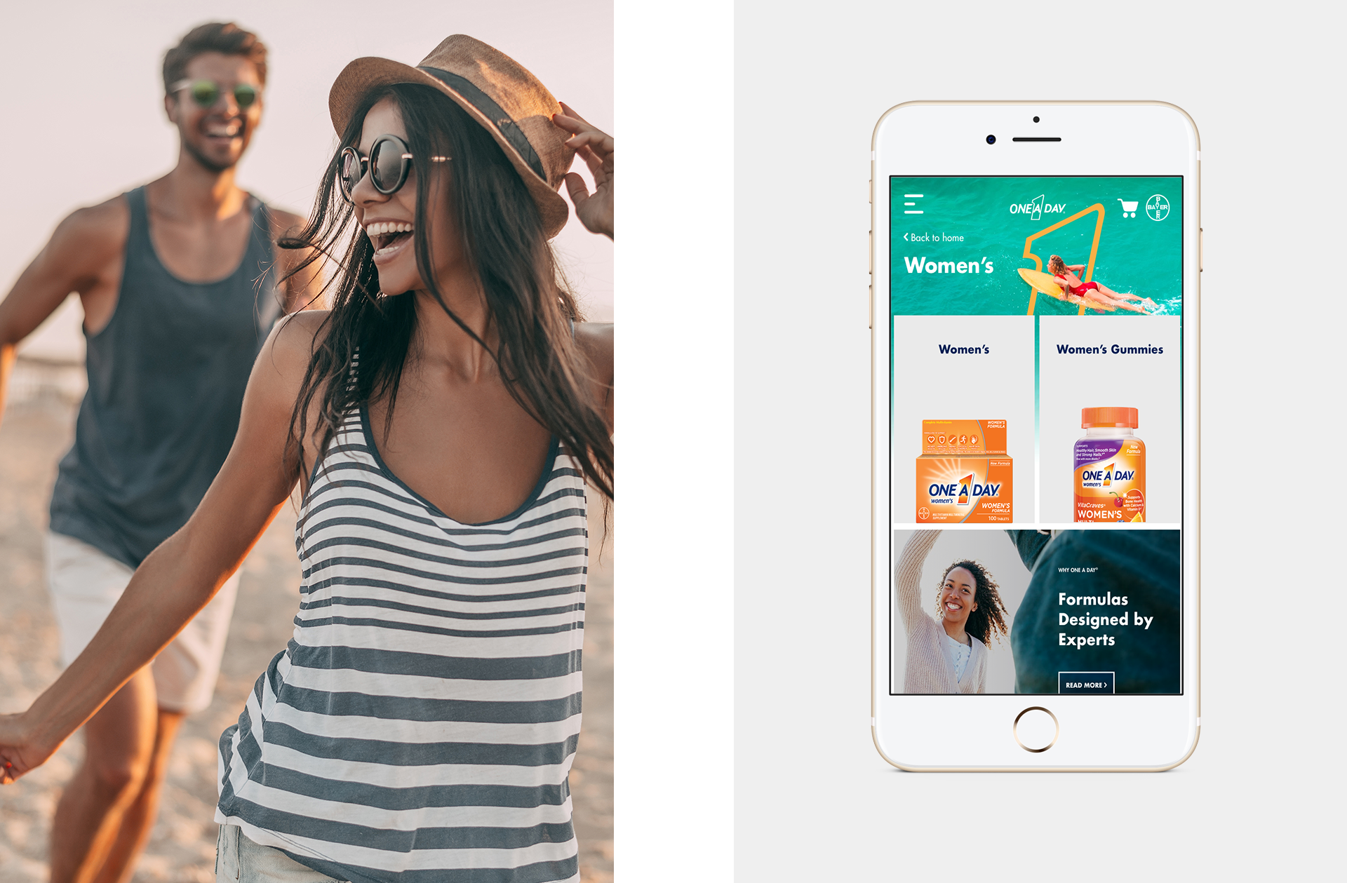
The redesign improved and clarified the tools needed to buy and save. The navigation structure was simplified to match consumer language to help visitors begin their journey to conversion.
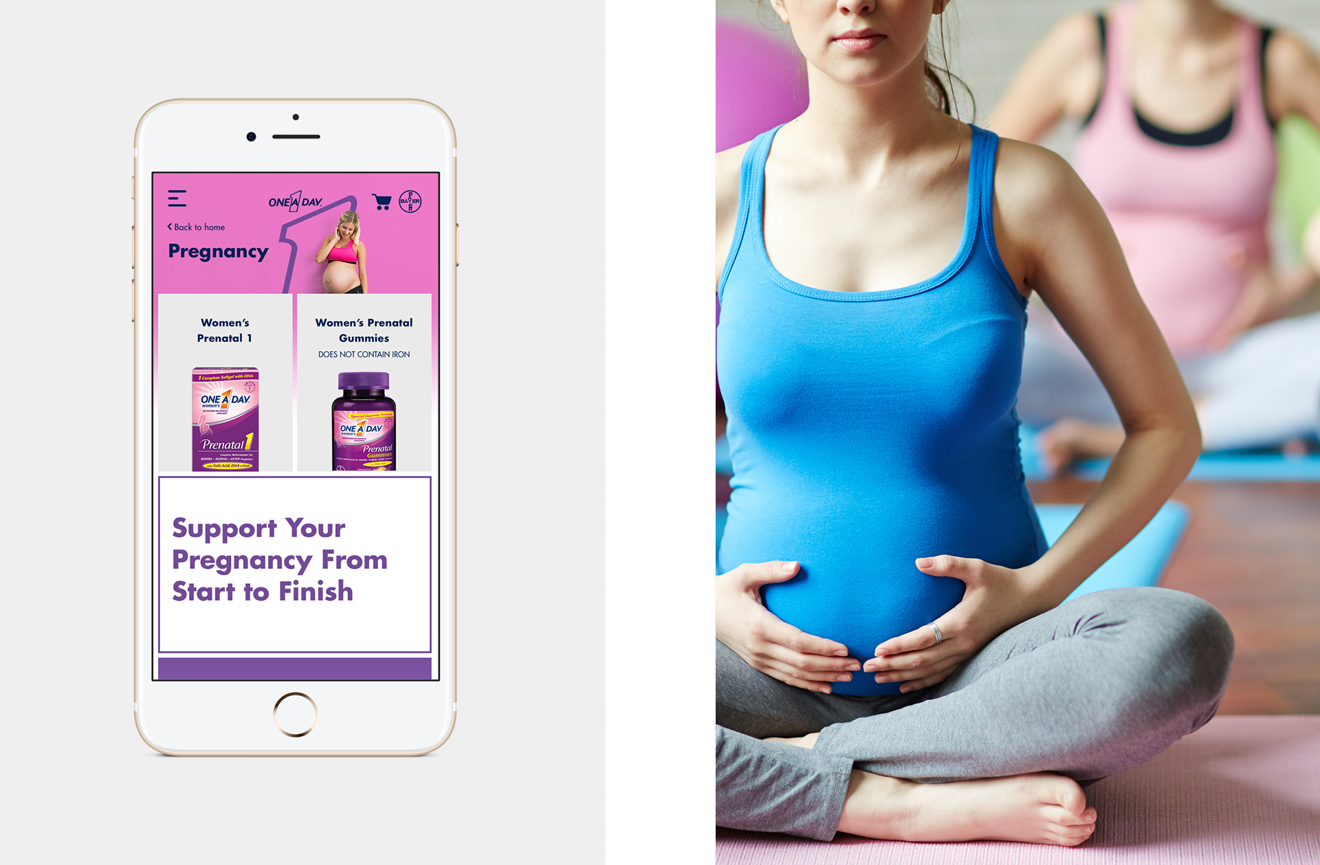
The homepage was category driven with large tiles that differentiated the user type: users knew what areas to start their searches (ex. women's or men's products), but didn't know exactly what products would be best.
The homepage was category driven with large tiles that differentiated the user type: users knew what areas to start their searches (ex. women's or men's products), but didn't know exactly what products would be best.
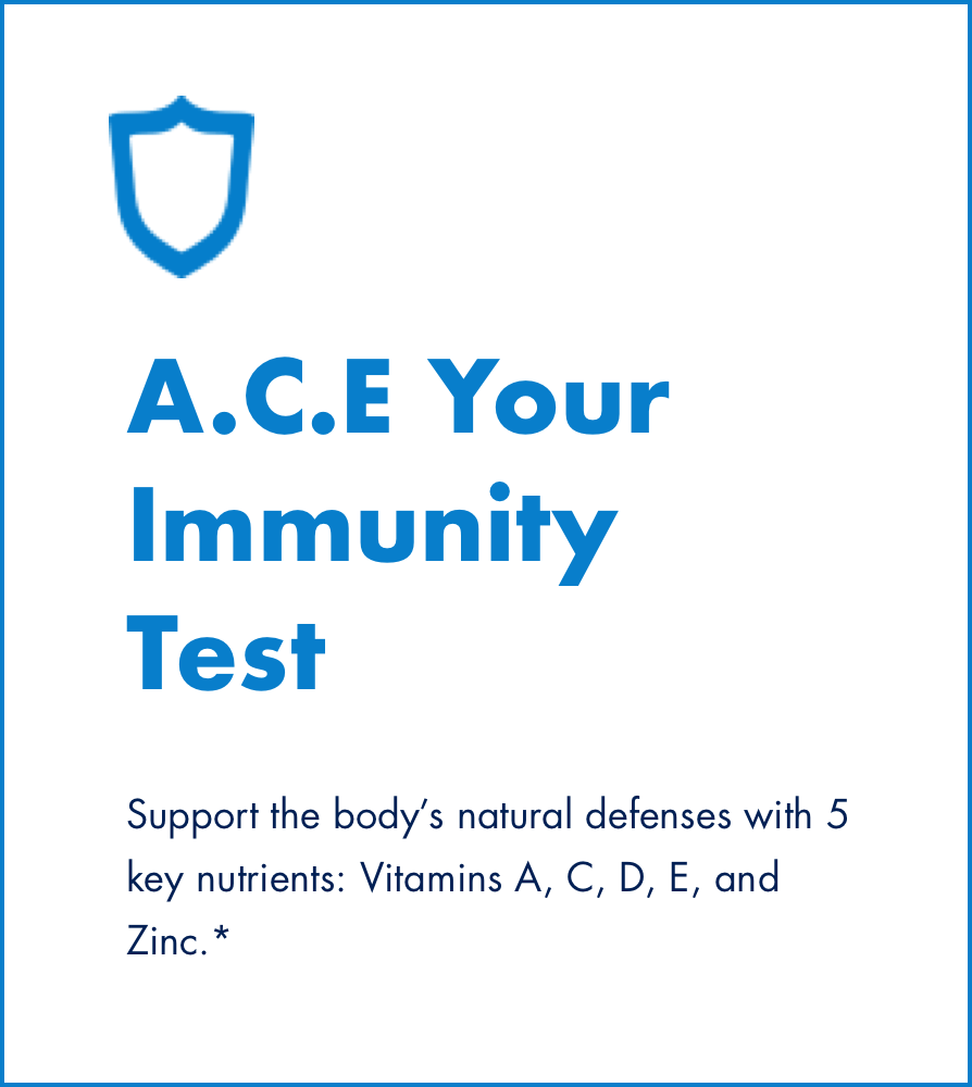
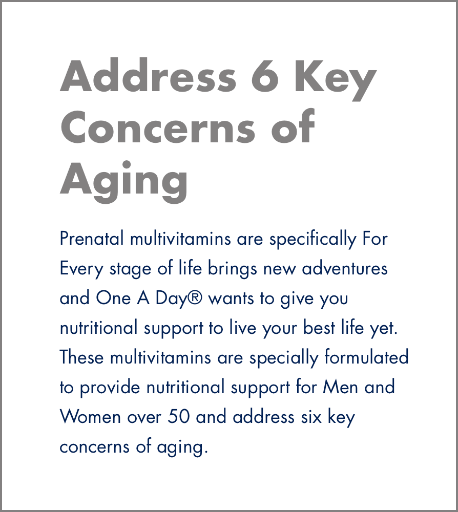
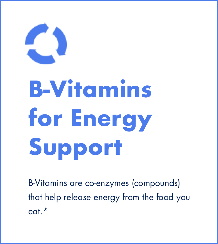
All content is represented by tiles.


The redesigned site is easy to navigate and to discover new products while researching and educating yourself in the process.
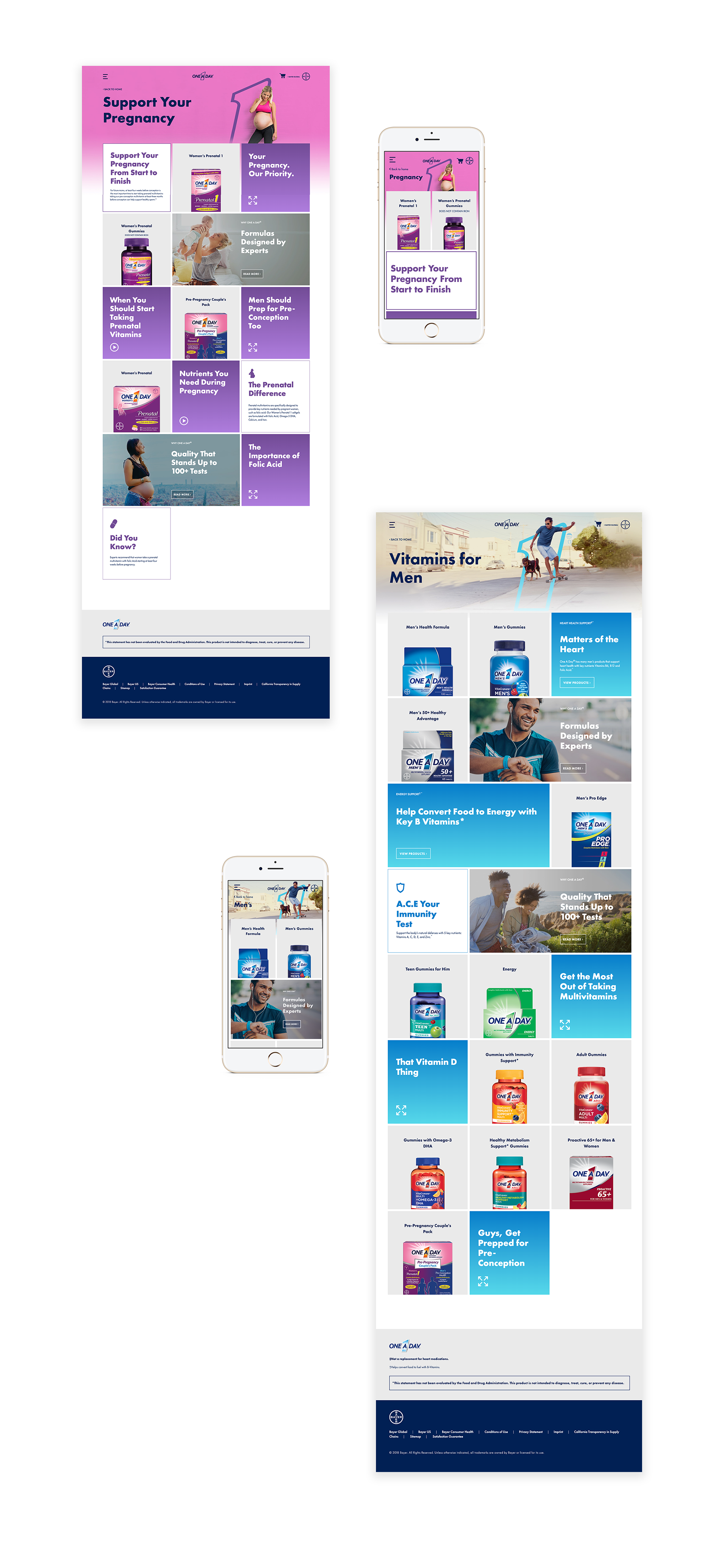
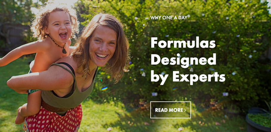
Learning more about a specific product is now easier than ever before.