COMPANY: Makeable
ROLE: Creative Director
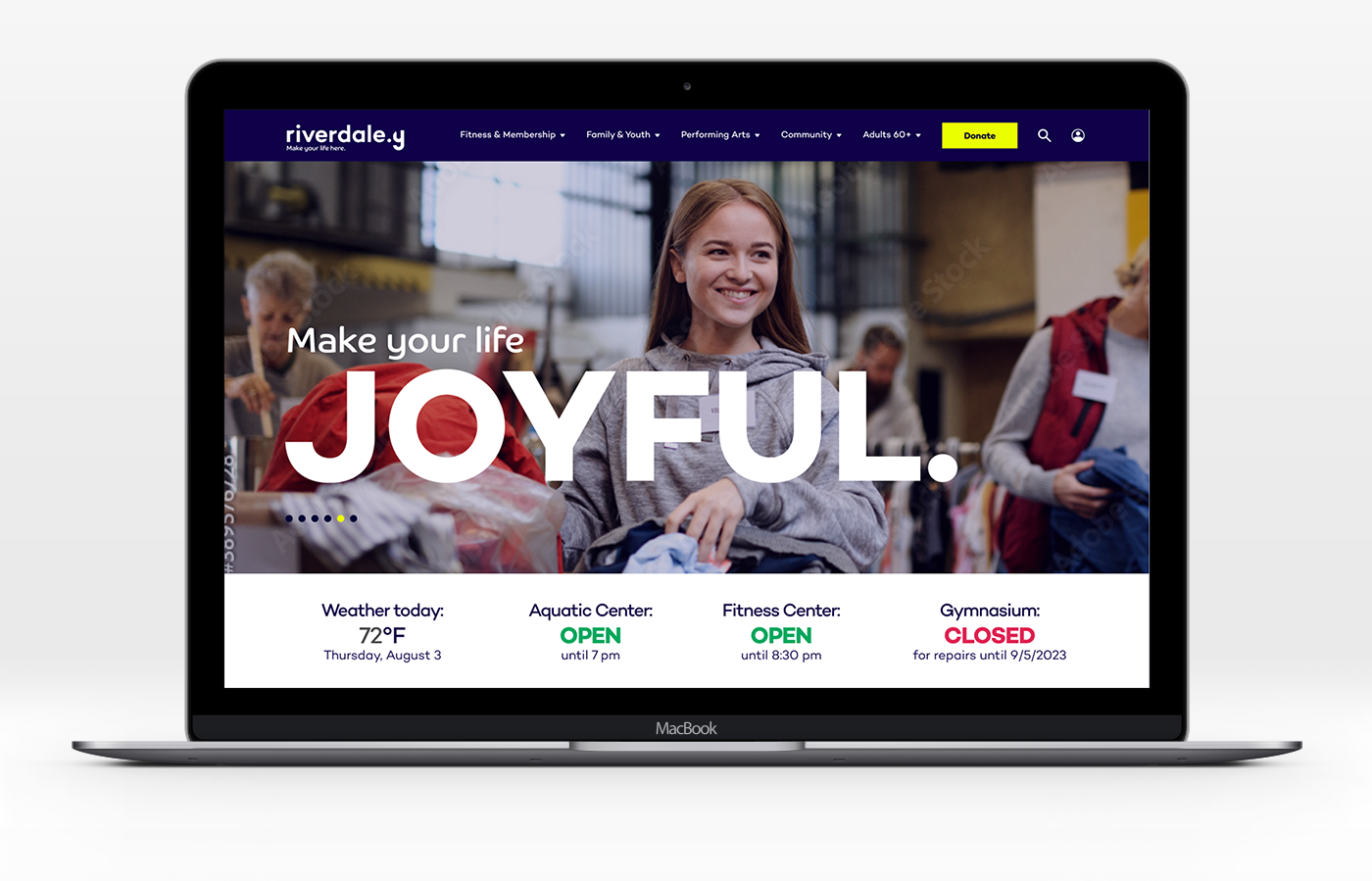
CHALLENGE: Riverdale Y did not have a consistent or cohesive brand presence. The community didn't know what the Riverdale Y offered, and most residents didn't take advantage of its services.
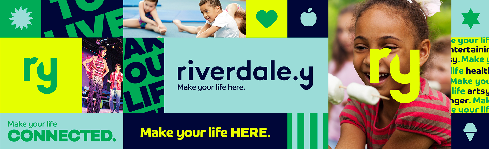
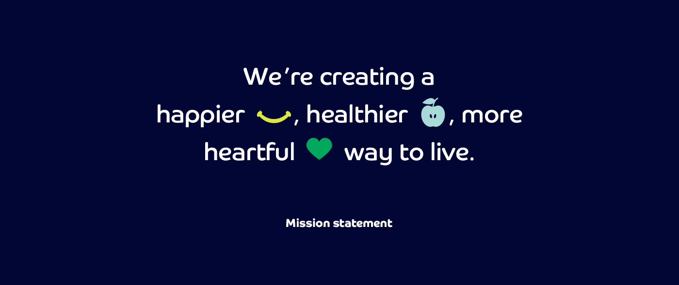
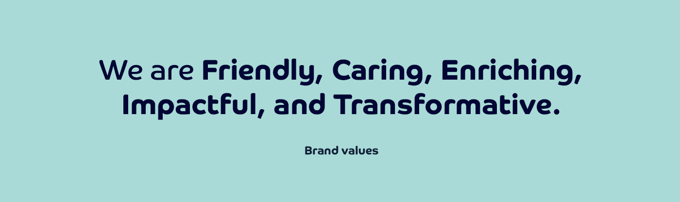
SOLUTION/CONCEPT: The Riverdale Y was rebranded to encapsulate health, happiness, and connection.

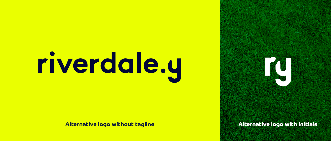
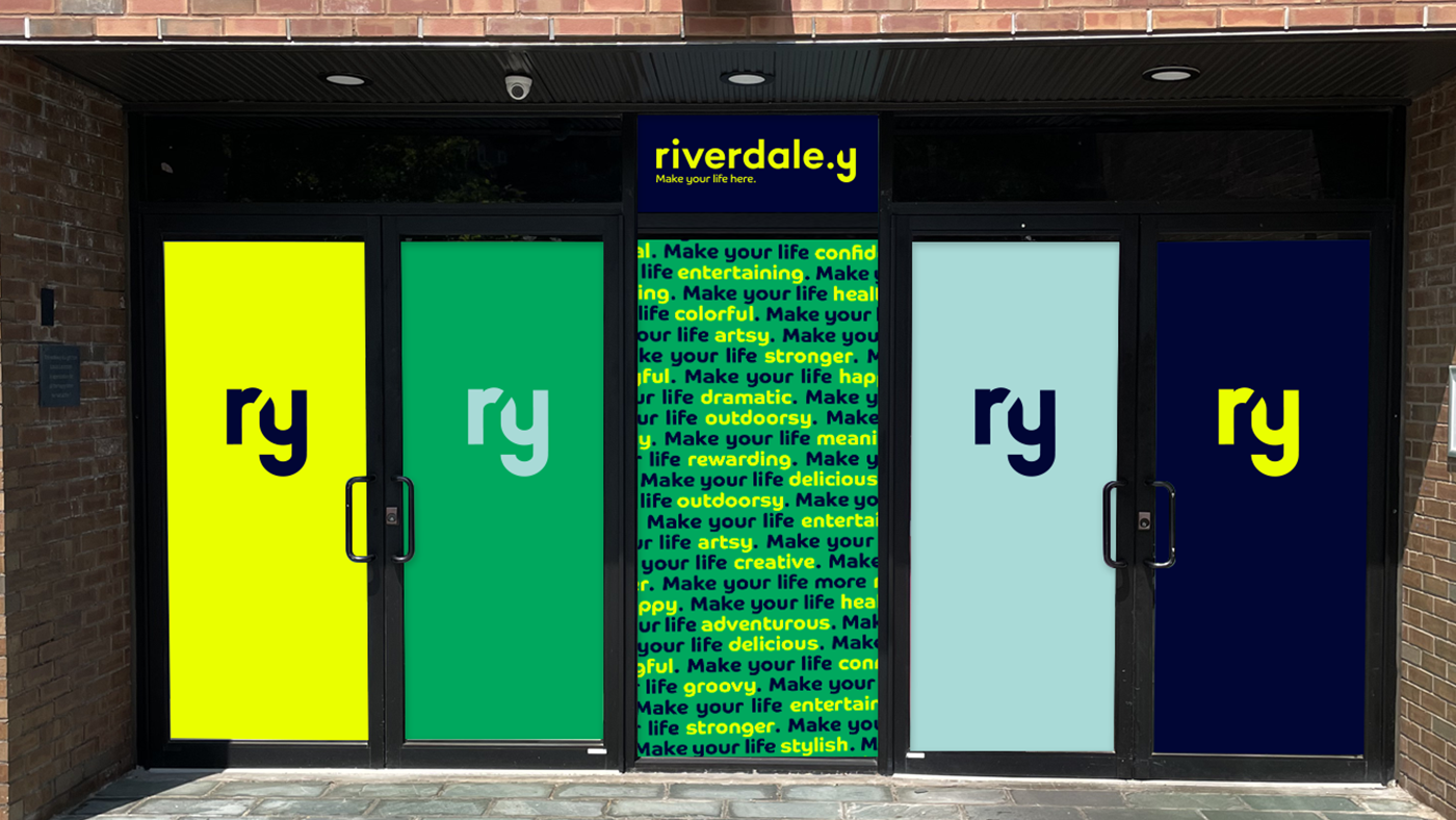
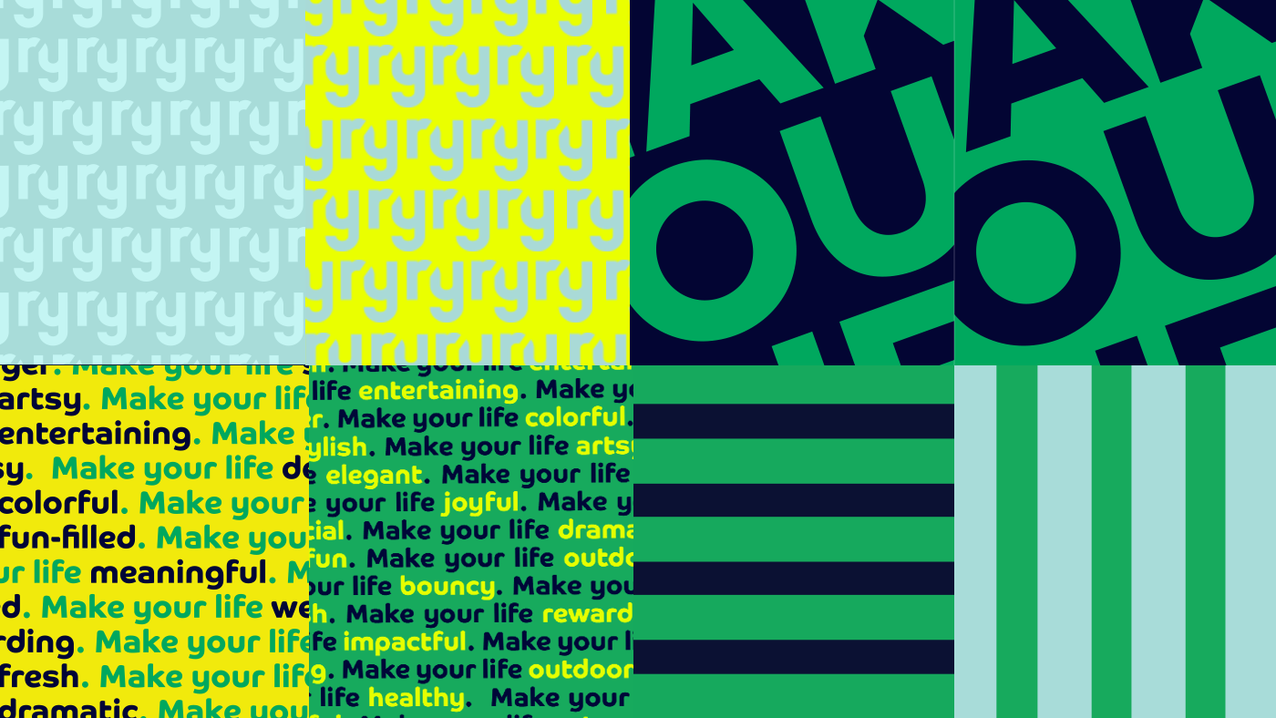
The new brand identity is simple and unintimidating. It uses lowercase characters that are geometric and equidistant to express that all friends and neighbors are welcome. The initials R and Y form an alternative logo icon. When the R and Y are together, they create a subtle nod to its location in New York.
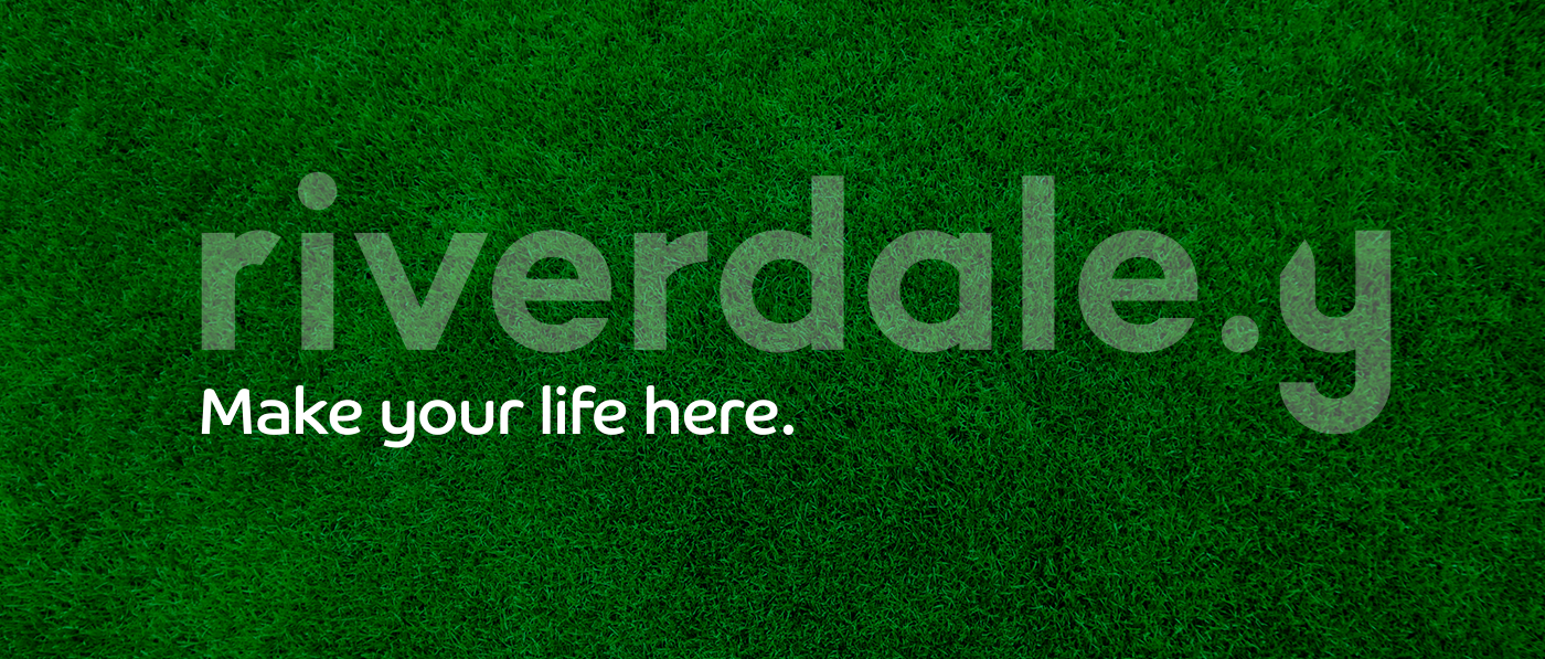
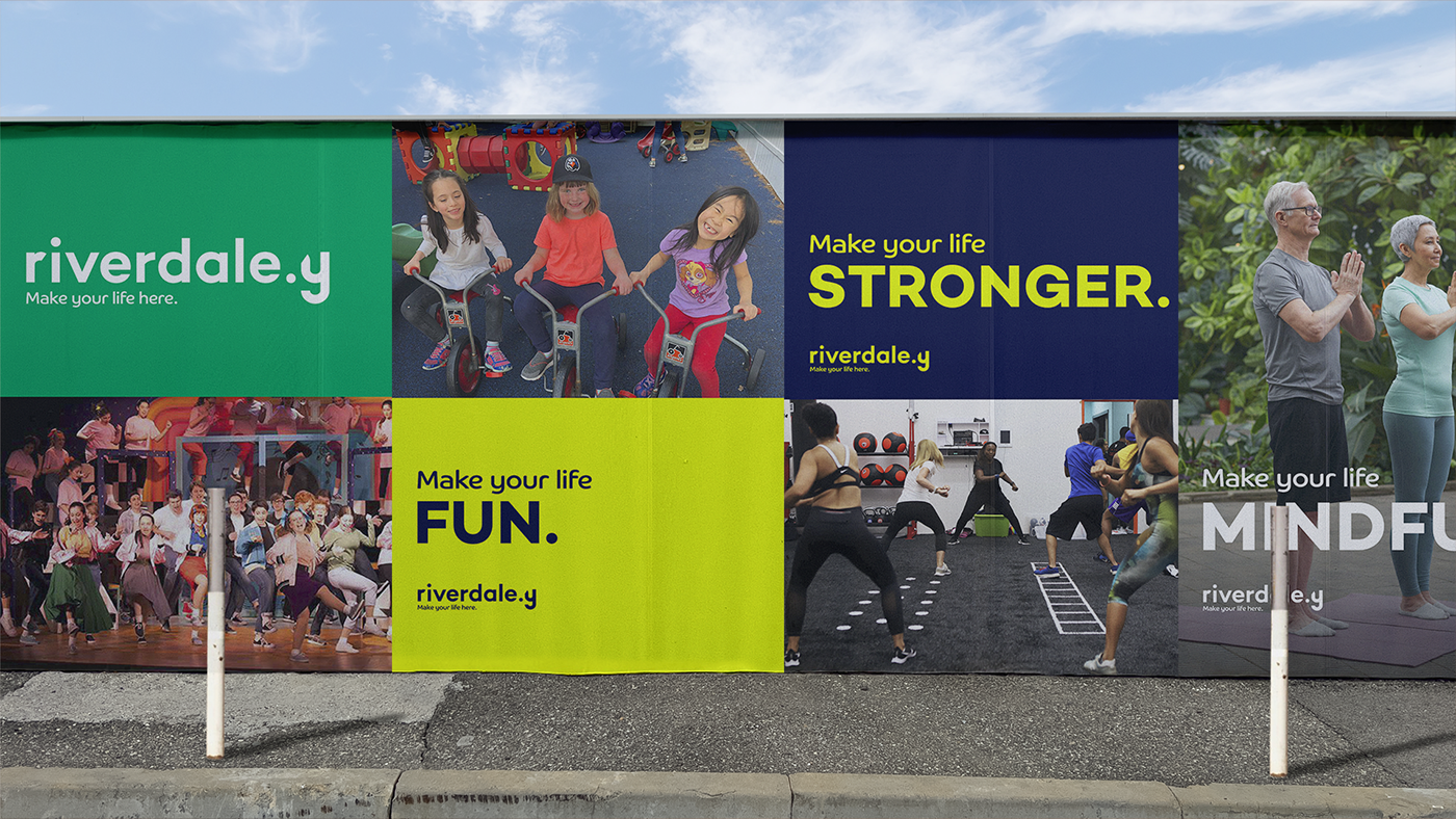
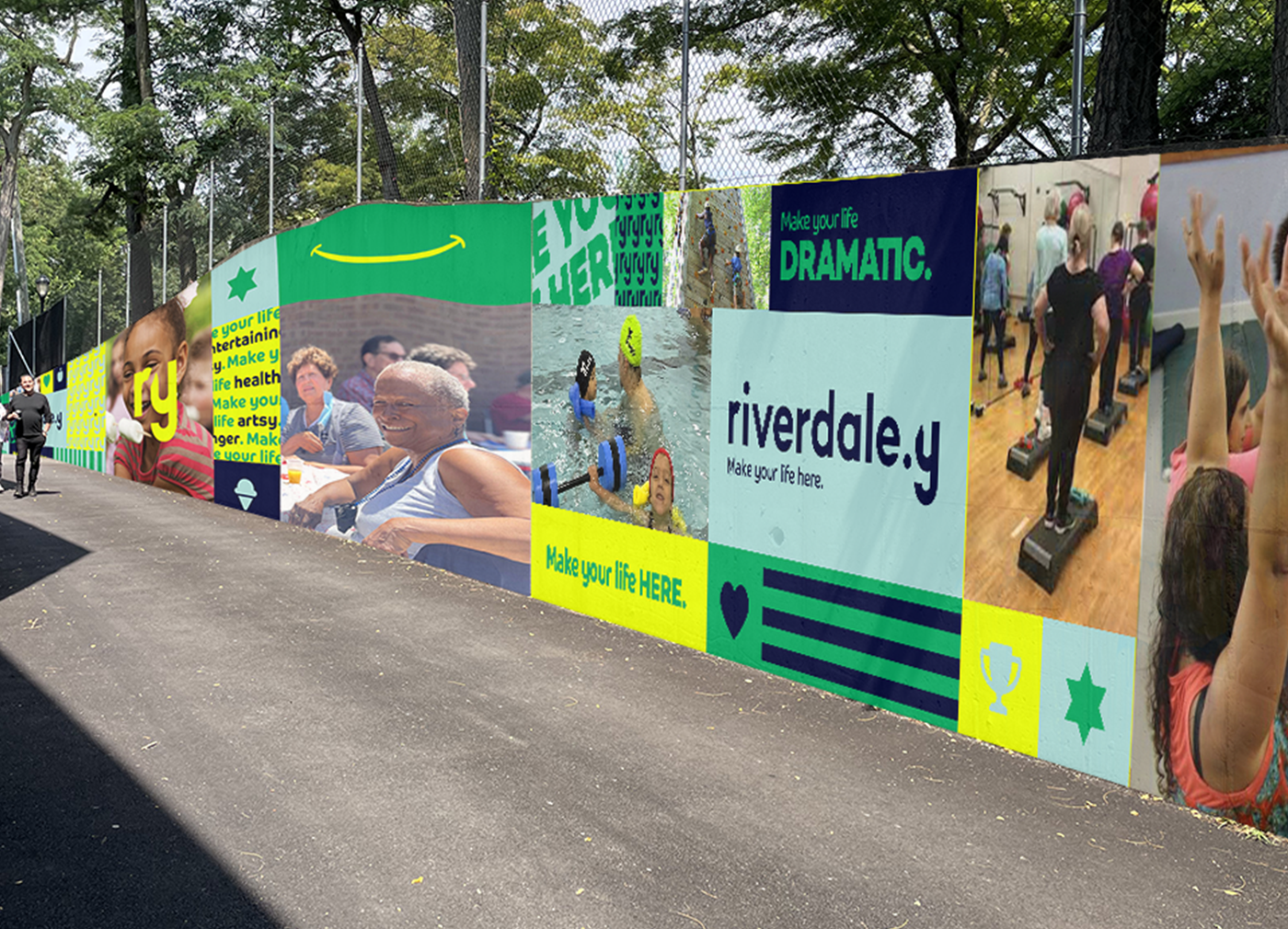
The tagline, make your life here, was so fitting because many things are available at Riverdale Y. Visitors don't usually experience one thing and leave. Instead, they keep coming over and over again to try new things or meet new neighbors and friends. We aren't the least bit surprised to learn that there are people who joined the Riverdale Y for the early education center and stayed well beyond when that child had graduated from college.
People do make their lives here at the Riverdale Y.
People do make their lives here at the Riverdale Y.
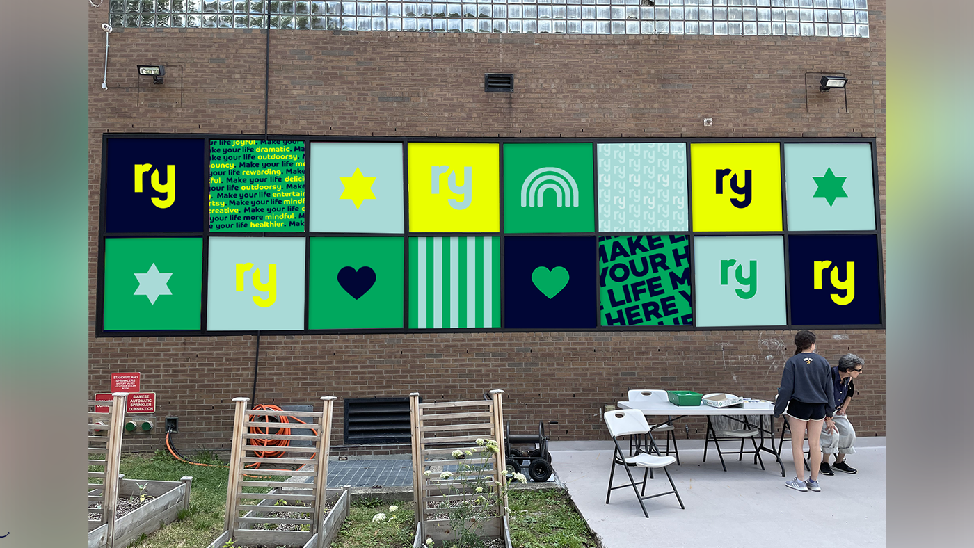
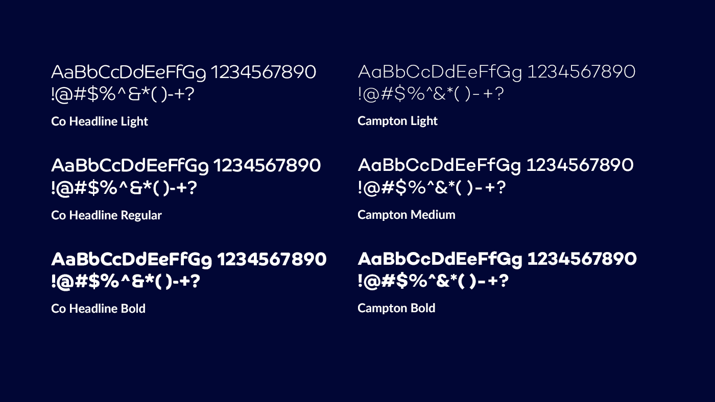
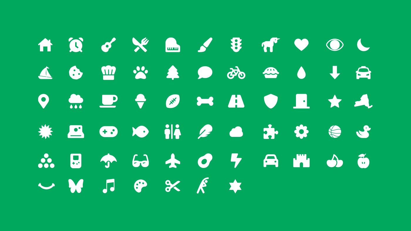
We created a scalable brand system for the Riverdale Y to understand
and reproduce.
and reproduce.

We soon realized that this logo looked great in all sorts of environments.
Custom "institutionale" pattern
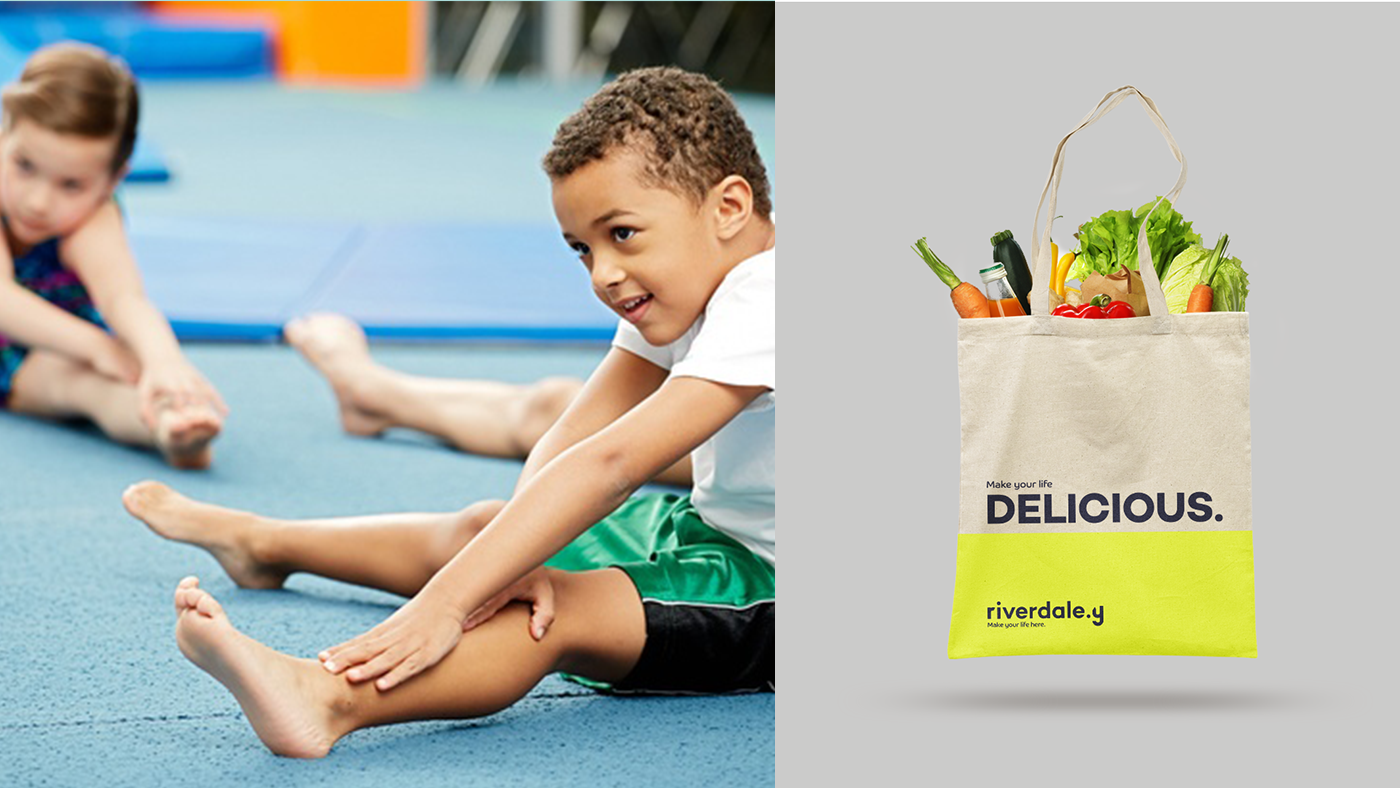
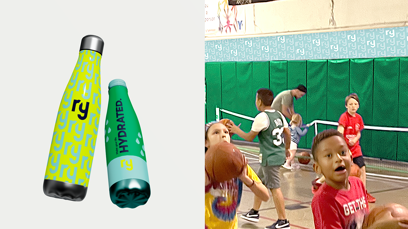
Branded reusable bags to be sold online
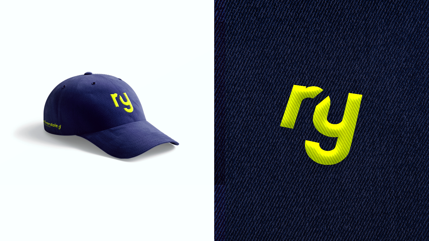
Branded clothing to be sold online
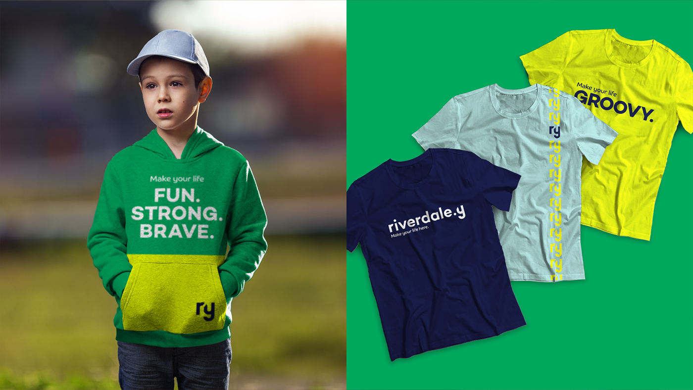
Branded clothing to be sold online
The brand is easily recognizable from outside of the building. It totally transforms the space from a building to a warm and welcoming community.